The graphic novel adaptation of Octavia E. Butler’s Kindred that I wrote/lettered and John Jennings drew will be released by Abrams ComicArts on January 10, 2017 (available for pre-order now). In recognition of that momentous occasion, I’m writing 31 blog posts about the path from novel to graphic novel. This is 31 Days Of Kindred.
* * *
Day 25
Color Codes
* * *
One concern with the visuals in Kindred was the best way to differentiate between the scenes in the 19th century and the scenes in the 20th. Often, in visual narratives that feature scenes taking place in both past and present, the colors in the past tend to be muted or washed out. This is sometimes referential of old printing or film processes as in when stories set in the past are meant to look like black and white film, or when comics flashbacks set in the 1940s-60s mimic the Ben-Day dots used to print color during that era. Other times it’s a technique that communicates the imminence of the present, the distance of the past.
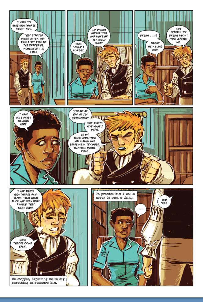
For Kindred, we decided pretty much from the start to do the opposite: the past is rendered in a vibrant, full color palette, while the 1970s are monochromatic.
The practical reason for having two different color schemes is to make it easy to keep track of which time period our time traveler is in. The reason we chose to have the past be more colorful is that, in the novel, both Dana and Kevin note that things in the 1800s seem more visceral; they feel more alive since injury, violence, and death are much more common.
There are also scenes in Kindred where the characters note that they feel more at home in the past than their own time. The muted colors of the 1970s in the graphic novel also communicate Dana and Kevin’s sense of disconnection from their home time.
In addition to this color scheme, John also included a lot of a particular shade of blue, called haint blue. Although this color is found in the deep south, most often South Carolina, and not in Maryland, where the plantation in Kindred is located, he found the color appropriate. “Haint” refers to ghosts or spirits trapped between life and death, and the color blue is meant to keep these spirits from entering a house. In Kindred, the color tends to refer more to Dana as a sort of ghost, haunting her own past. And, rather than keeping Dana out, the color seems to keep her trapped in the past.