
The graphic novel adaptation of Octavia E. Butler’s Kindred that I wrote/lettered and John Jennings drew will be released by Abrams ComicArts on January 10, 2017 (available for pre-order now). In recognition of that momentous occasion, I’m writing 31 blog posts about the path from novel to graphic novel. This is 31 Days Of Kindred.
* * *
Day 21
Cover Story
* * *
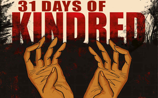
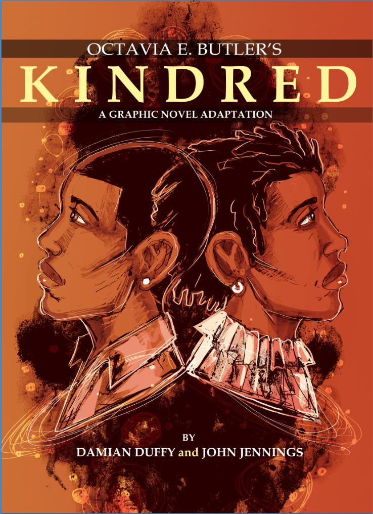
Here’s the cover of Kindred: A graphic novel adaptation:
![]()
Like every other aspect of the graphic novel, the cover is a combination of the efforts of a number of people. John did the illustration, of course, and the title and typography was designed by Abrams art director/designer Pam Notarantonio, but there were a number of conversations between me, John, our editor Sheila Keenan, Pam, Abrams ComicArts Sales department, etc. (Naturally, being the writer guy, I was only privy to some of these conversations, and I’ll only talk about those, but I just wanted to point out the large scale collaboration that a project like this entails.)
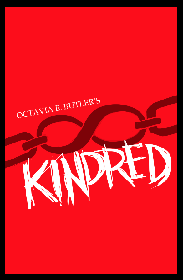
John and I started from the various cover designs of the several editions of Kindred that have been printed over the 37 years since its publication. Such as:
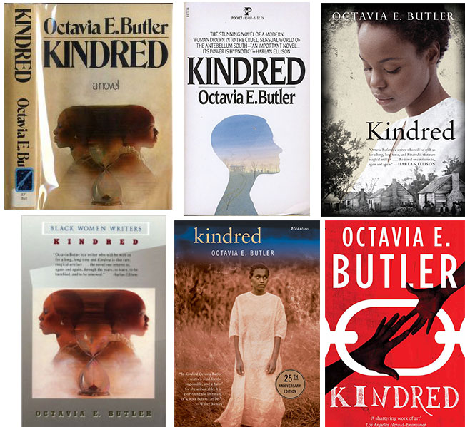
Of these the photographic covers, such as the woman’s face over the house and the woman in the white dress, were always our least favorite. The photo covers always seemed to both John and myself as somehow beside the point of the novel. Certainly there are African American woman in rural areas in the narrative, but both seemed to have a certain wistful or Romantic quality that contrasted with our understanding of the story. Similarly, the cover with a foggy nature scene inside a profile seems to have a similar tone (although this is actually the first time I’ve come across that one.) The description on that cover, of the world of the antebellum South as both cruel and “sensual” likewise seems discordant from the actual story. I mean, it is sensual in that Dana (and the reader, through Dana) encounters the real life pain and hardships of slave life. But there’s a certain feint towards a romance novel implicit in that word choice that doesn’t really jibe with the harrowing plot.
While there are love stories to be found in the novel, that love is generally twisted into something dark, traumatic, painful. Love conquers very little.
Rather than a Romantic novel, we’ve always thought of the book as pulling on tropes of the Gothic, and more generally, of horror stories. For her part, Butler described the novel as a “grim fantasy,” bristling at the book being characterized as science fiction (as you can see from the library sticker of the blue rocketship on the spine of the first cover, above). Butler made the distinction because, despite the time travel, there wasn’t anything scientific in the story–none of the genetic manipulations or space travel to be found in her other novels.
I’ll return to the notions of Gothic horror in the story in the novel and graphic novel in another post. Suffice it to say, the Romantic trappings of some covers were the exact opposite of what we wanted to go for.
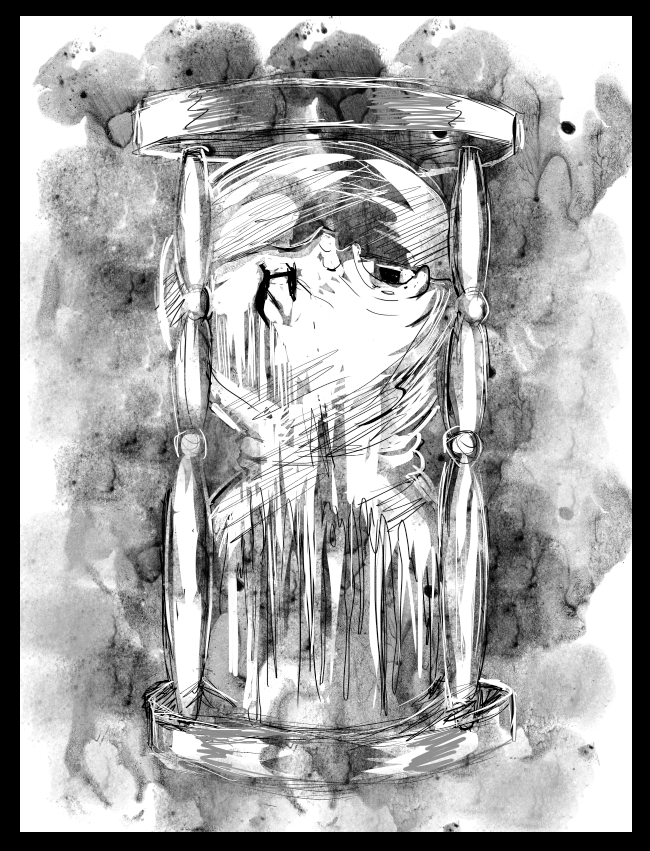
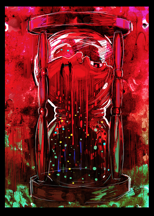
We were especially drawn to the image of the two overlapping silhouettes facing in opposite directions, with an hourglass between them. Which resulted in John drawing these designs:
Being graphic novelists, we were also drawn (pun!) to the iconic nature of the red novel cover with the white chain links and to black hands reaching towards each other. These inspired a few other designs from John:
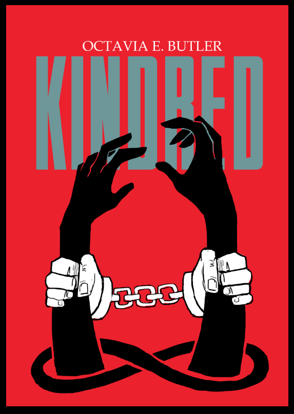
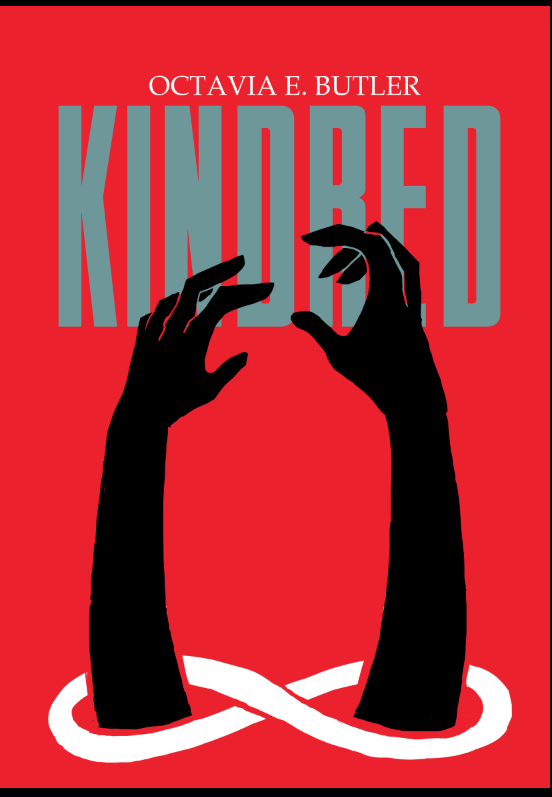
The motif of the Möbius strip as chain emerged as a favorite among all involved, as did the white hand grasping the black, the intertwining of time travel, race-based captivity, and the literal connection between Rufus and Dana. Eventually the illustrative elements of the hourglass designs combined with the iconic elements of the Möbius strip designs, and the final cover emerged.